Tuesday, 16 December 2014

Preliminary task to now, and how I have improved


During the production of my preliminary task it allowed me to understand the basic conventions used in a magazine cover, for example a masthead, cover lines, and the way the writing is on the cover. By producing this basic cover with the little knowledge I had it allowed me to understand the programs and technologies used to create the magazine. By doing the preliminary task it helped me to make my actual magazine look more realistic and believable. By using pull quotes it helped me to entice the reader, in the preliminary task my pull quotes were longer and not as punchy and this may make the reader get bored, and also it doesn't look as professional or as realistic. I noticed this when I was doing research for my real magazine and I used the experience of creating my preliminary magazine to make my actual magazine look like a real magazine.

I also learnt that house style is very important, you don't want to have lots of random colours, you need to have a structure and base behind the style of writing and the colours used. In my preliminary task I Used a variety of different colours, although this didn't look very professional it helped me to realise what colours stood out well and made the magazine look realistic. The use of font also determined whether the magazine looked realistic or not, I also found a font for my writing that also went along with the country theme as well as making the magazine look realistic.

The preliminary task also helped me to get an understanding of the programs that would be used and decide, what program was best for different things throughout the production. By using these programs I was able to make my main magazine look more realistic and the experience before hand definitely helped me throughout this process.

Monday, 15 December 2014

Magazine feature article production

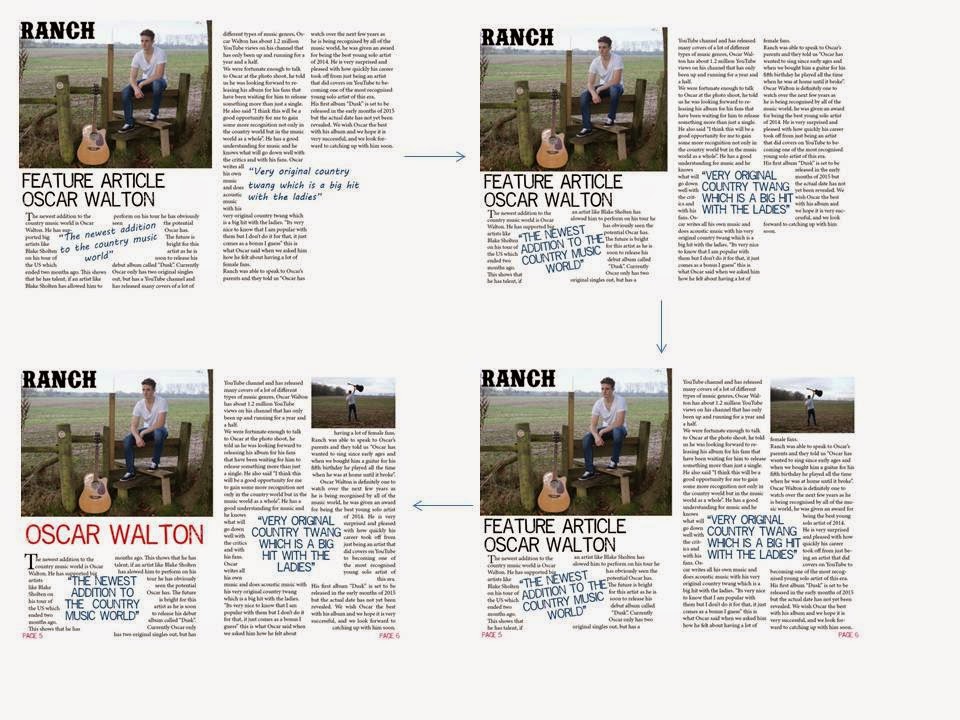
Throughout the production of my feature article I used all the techniques that I had learnt about during my research such as, pull quotes, drop caps, and columns which would structure it well and make it look more like a feature article. I wasn't sure whether I would put the image on the hole of the left hand page or just half, but I decided to go for just half because I felt I could add more feature into it such as another pull quote and a header to start off the article.


Magazine contents production

As I was creating my magazine contents page I saw that making the fonts more interesting would give it a more interesting look and not make it look boring. Although my contents page is simple it is still interesting look at and stands out well because of this. Also putting my masthead on the contents page as well and the word contents in my masthead font made stand out well also.


Magazine cover production

Throughout creating the cover I realised that using different fonts and styles of writing made a magazine look more realistic. I had to choose carefully where to place each cover line so that it would clearly show what is what, for example I needed to make it clear that the main image was of Oscar Walton. As I got further down the line of creating the front cover I added more real magazine features, such as the boarders on the top and bottom of the page and the bar code, these made it look more like a magazine.


The use of technologies


I used Adobe InDesign to make the magazine look professional and realistic. I developed skills such as knowing how to make a magazine look realistic, how to contrast a picture and words and how to structure a page.


I used a Sony camera to take my photos. It was very easy to use and the picture quality came out well throughout however some things were out of my control, for example during the photo shoot we would have to wait for clouds to come over at some stages so that the lighting would be perfect to take the photos, this is an example:
 Bad lighting                                                                                              Good lighting


I didn't use photo shop for my magazine photos this is because I wanted it to be natural, country genre is more rural and it started from the cowboys who would be out in nature everyday, so I thought not editing my pictures was very important for my style and the way my magazine looks and the feel it has.


I used Microsoft PowerPoint for much of my research and planning, and for some my evaluation analysis. It was very useful and worked well with the blogger as all you had to do was put the document into a Jpeg and you could easily put it onto blogger.


How Ranch appeals to my target audience

Ranch appeals to my target audience in the way that it is structured and the language used. It is quite formal in the writing and the structure and design is also formal but in places it has some originality to it in places. For example my contents page has a very unique design to it as the font and the structure is quite informal, but although it is very simple, it is still interesting to look at. This type of structure will appeal to the younger audience but the formal writing will appeal more to the older audience.
My magazine doesn't just cover the new and up and coming artists, it covers a wide variety of artists within the country genre. This means people will be able to keep up to date with the well known artists, this will appeal to the country fans as the reason the well known artists are popular is because the audience likes them so using them in my magazine will mean I get a larger audience as well. This is is done by putting the artist name on my cover lines on the front cover. When they see an artist name on the cover, it may appeal to them and make them want to buy it.
As country is quite a natural genre I liked to use quite rural locations for my photography, by doing this it would appeal to the older audience as they are more for nature and would appreciate the images more. Also my main artist on the front cover (Oscar Walton) would appeal to the younger audience, as he is young himself and they may feel they can relate to him, also as he is good looking this may attract a larger female audience for this particular edition of Ranch. Also his good look could attract a younger male audience if they want to copy his style.

The font used on the front cover is very simple and easy to read, this may appeal to the audience as it is not complex and the layout is very easy to follow. The house style is very consistency and having consistency will appeal to both genders, and make them feel comfortable with it.


Friday, 12 December 2014

Audience for media product

My target audience for my media product before I started the production was for males and females from 25-50 years old and the demographics of ABC1. As the progress of the production of my magazine is now finished, I have decided I would want my magazine to appeal to 20-50 year olds. This is because I think my feature artist would draw in a younger audience because the artist is young himself. I also thought before I started making the magazine that the audience would be quite laid back and would like all music as well as country, this is why I included 'Josh Tinder' as an artist who started as country but has branched off as his career has progressed.
The way I wrote throughout the magazine would appeal to the older audience. My house style was also important to attract my audience as using colours like blue would attract more males and using red would attract females although red is a colour that appeals to both genres equally. Also my the font I used in my text was more to do with the theme of the magazine, I didn't really think about the audience whilst choosing my fonts.
My feature artist could appeal to my audience, because of the way he looks, or the way he dresses could affect if they are drawn to look at the magazine on shelf in a shop. Also the way Oscar speaks in the feature article, very modest, will make the audience feel as if he is just a normal guy and this way they will feel they can relate to him.
From this analysis I can conclude that my target audience hasn't really changed, only that the magazine could appeal to a larger age range as it has now got a younger vibe to it due to the model I used and the way I portray my main artist (Oscar Walton).